For authors and artists, a homepage is more than a digital storefront; it is a curated exhibition, a narrative portal, and a direct line to audience engagement and commercial opportunity. The layout chosen dictates the initial impression, guides user flow, and ultimately influences whether a visitor becomes a reader, a collector, or a patron. Selecting an effective homepage layout requires a strategic alignment between creative output, commercial objectives, and target audience behavior. A well-designed layout can transform a casual visit into a meaningful interaction, driving book sales, art commissions, event attendance, or community participation. Conversely, a poorly conceived layout can obscure valuable work, frustrate visitors, and dilute brand impact, regardless of the quality of the creative output.
How to Choose the Right Homepage Layout
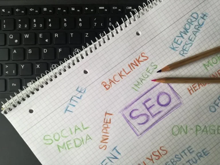
Selecting an optimal homepage layout involves evaluating several critical factors specific to authors and artists. First, consider your primary objective: Is it to sell books, showcase a portfolio, build a community, or promote events? This objective should dictate the layout's focal point. Second, assess your content type: Are you primarily visual, textual, or multimedia? A painter needs an image-heavy layout, while a novelist requires prominent text and clear calls to action for publications. Third, understand your audience: Are they seeking specific works, general discovery, or personal connection? A layout focused on direct sales differs from one emphasizing an artist's journey. Fourth, evaluate your update frequency and content volume. A blog-centric layout suits frequent posters, while a static portfolio works for artists with less frequent major updates. Finally, consider your technical comfort and maintenance capacity; complex interactive layouts demand more resources than streamlined, static designs. Prioritize clarity, intuitive navigation, and mobile responsiveness to ensure accessibility and a positive user experience across all devices. Furthermore, applying simple SEO tips for portfolios can significantly improve your site's visibility to potential clients and collectors.
1. Minimalist Portfolio Showcase
This layout prioritizes visual impact and direct access to an artist's or photographer's core work. It typically features a clean, uncluttered design with large, high-resolution images or video snippets as the dominant elements. Navigation is often subtle, appearing as a hidden menu or simple links, ensuring the artwork remains the primary focus. The aesthetic emphasizes sophistication and allows the creative output to speak for itself without distractions. This approach is about quality over quantity on the initial view, encouraging deeper exploration into curated galleries.
Best for: Visual artists, photographers, illustrators, and designers whose work is inherently self-explanatory and visually compelling. Ideal for those with a strong, cohesive body of work they want to present immediately.
Pros:
- High visual impact and immediate engagement through large-scale imagery.
- Clean aesthetic conveys professionalism and artistic confidence.
- Reduces cognitive load for visitors, making it easy to focus on the art.
- Often loads quickly due to minimal extraneous elements.
Cons:
- May not be suitable for authors or artists with extensive textual content or diverse media requiring complex categorization.
- Requires exceptionally high-quality visual assets to be effective.
- Can be perceived as less personal if not balanced with an accessible "About" section.
- Limited space for detailed project descriptions or contextual information on the homepage itself.
Verdict: A powerful choice for creators whose primary commercial asset is their visual work, offering an elegant and direct pathway to their portfolio with minimal friction.
2. Book-Centric Landing Page
Designed specifically for authors, this layout places a single, prominent book cover at the center of the homepage. The goal is singular: to drive sales or pre-orders for a specific title. Key elements include a large book cover image, a compelling blurb or hook, prominent "Buy Now" or "Pre-order" calls-to-action (CTAs) linked to retailers, review snippets, and perhaps a short author bio or video trailer. Navigation is secondary, often relegated to a simple menu for other books, an "About" page, or a blog. The design focuses on persuasive copywriting and clear conversion pathways.
Best for: Authors launching a new book, those with a flagship title, or writers who want to consolidate marketing efforts around one primary publication. Especially effective for fiction authors.
Pros:
- Optimized for direct book sales with clear CTAs and minimal distractions.
- Immediately communicates the author's current focus and primary offering.
- Facilitates targeted marketing campaigns by providing a dedicated conversion page.
- Allows for detailed presentation of book-specific information (synopsis, reviews, excerpts).
Cons:
- Less effective for authors with multiple books who need to showcase a broader catalog simultaneously.
- Can feel repetitive if the author frequently launches new titles and doesn't update the layout.
- Limited space for personal branding beyond the book itself.
- May not appeal to visitors seeking a general overview of the author's work or blog content.
Verdict: An essential layout for authors with a clear sales objective for a specific title, providing a highly focused and conversion-oriented user experience.
3. Scrolling Narrative/Storytelling
This layout guides visitors through a sequential experience, often using parallax scrolling, animated elements, or distinct content blocks that unfold as the user scrolls down. It's ideal for presenting a journey, a project's development, or a series of interconnected works. Each section builds upon the last, creating a cohesive story. Visuals are integrated with text, and calls to action are strategically placed at natural breakpoints in the narrative flow. The design emphasizes immersion and a curated discovery process.
Best for: Graphic novelists, concept artists, authors with serialized content, or artists whose work tells a specific story or progresses through stages. Also effective for promoting a single, complex project.
Pros:
- Creates an immersive and engaging user experience that encourages longer dwell times.
- Excellent for explaining complex ideas or showcasing a creative process step-by-step.
- Allows for a rich blend of text, images, and multimedia to enhance the narrative.
- Can generate strong emotional connections through structured storytelling.
Cons:
- Can become very long, potentially overwhelming users on mobile or with slow connections.
- Requires significant content planning and design effort to execute effectively.
- Navigation to specific sections might be less intuitive than traditional menu-based layouts.
- SEO can be challenging if content is primarily within a single, long page without distinct headings.
Verdict: A powerful, cinematic option for creators who want to guide their audience through a specific journey or narrative, prioritizing engagement and depth over quick information retrieval.
4. Blog-First Content Hub
This layout positions the author's or artist's blog as the central feature of the homepage, displaying recent posts prominently. It's designed for creators who regularly publish articles, essays, creative writing, tutorials, or behind-the-scenes content. The homepage typically features a grid or list of post excerpts with featured images, clear categories, and subscription options. Other sections, like portfolio or books, are accessible but secondary. The emphasis is on fresh content and fostering an ongoing dialogue with the audience.
Best for: Authors, poets, essayists, or artists who use their blog as a primary platform for sharing insights, process, or serialized creative work. Ideal for building a loyal readership and demonstrating expertise.
Pros:
- Excellent for SEO due to consistent new content, attracting organic search traffic.
- Builds audience loyalty and engagement through regular updates and interaction.
- Establishes the creator as an authority or thought leader in their field.
- Provides diverse content opportunities beyond direct sales, such as affiliate marketing or workshops.
Cons:
- Requires a significant ongoing commitment to content creation to remain fresh and relevant.
- May overshadow direct portfolio or book sales if not carefully balanced with CTAs.
- Can appear cluttered if not designed with clear visual hierarchy and organization.
- Less suitable for artists whose primary commercial output is static visual art.
Verdict: The go-to layout for creators who prioritize content marketing and community building, leveraging consistent publishing to attract and retain an audience.
5. Event-Driven/Calendar Focus
This layout prioritizes upcoming events, exhibitions, readings, workshops, or performances. The homepage prominently features a calendar, list of dates, or a dedicated section for "What's Next." Key information includes event details, location, dates, times, and clear calls to action for tickets or registration. Often, it includes a map integration or a gallery of past event photos to build anticipation. Other creative work is accessible but takes a supporting role to the live engagement opportunities.
Best for: Authors on book tours, performance artists, workshop leaders, gallery artists with frequent shows, or musicians. Anyone whose commercial activity heavily relies on live appearances.
Pros:
- Drives attendance and ticket sales for live events directly from the homepage.
- Keeps the audience informed about current activities and opportunities for interaction.
- Creates a sense of urgency and exclusivity around limited-time engagements.
- Can be easily updated to reflect changing schedules or new opportunities.
Cons:
- Less effective for creators with infrequent events or whose primary income is not event-based.
- Requires consistent maintenance to keep event information accurate and current.
- May not adequately showcase a broad portfolio or extensive body of work if not balanced.
- Can appear empty or inactive if there are long periods without scheduled events.
Verdict: An indispensable layout for creators whose commercial success is tied to live interactions, providing a clear and immediate pathway to participation.
6. E-commerce Gallery/Shopfront
This layout transforms the homepage into a direct sales portal for physical or digital creative products. It features a prominent display of products (e.g., prints, original artwork, merchandise, digital downloads) with clear pricing, "Add to Cart" buttons, and filtering options. High-quality product photography is essential. The design emphasizes browsing and purchasing, often including featured products, new arrivals, or bestsellers. Navigation is geared towards product categories and a seamless checkout process.
Best for: Artists selling prints, original art, crafts, or merchandise directly. Authors selling signed copies, unique editions, or digital products (e.g., ebooks, audiobooks). Creators with a diverse range of purchasable items.
Pros:
- Directly facilitates sales and revenue generation from the website.
- Provides a comprehensive showcase of purchasable items with all necessary details.
- Offers a convenient and direct buying experience for customers.
- Allows for easy management of inventory, pricing, and promotions.
Cons:
- Requires robust e-commerce platform integration and maintenance.
- Can be complex to set up and manage, especially with varied product types.
- May detract from the pure artistic or literary experience if the commercial aspect is too dominant.
- Requires strong product photography and detailed descriptions to convert sales.
Verdict: The definitive choice for creators whose primary commercial model is direct product sales, offering a streamlined path from discovery to purchase.
7. Personal Brand Hub
This layout centers around the individual creator, positioning their personal story, values, and diverse creative outputs as the primary focus. It often features a prominent, professional headshot or portrait, a concise value proposition, and curated links to various aspects of their work (e.g., books, art, speaking, consulting, media appearances). The design aims to convey personality and expertise, building a holistic professional brand. Testimonials or media mentions are often integrated to build credibility.
Best for: Established authors or artists with multiple creative ventures, public speakers, coaches, or those who are their own brand. Ideal for building a comprehensive professional identity.
Pros:
- Builds strong personal connection and trust with the audience.
- Effectively showcases a diverse range of skills and accomplishments under one umbrella.
- Positions the creator as an authority and thought leader.
- Versatile enough to adapt to evolving career paths and new projects.
Cons:
- Requires a clear and consistent personal brand message to be effective.
- May feel less focused if the creator's outputs are too disparate.
- Relies heavily on high-quality personal imagery and compelling biographical content.
- Can be challenging for emerging artists or authors who haven't yet established a broad public profile.
Verdict: A strategic layout for creators who are their own brand, enabling them to present a unified professional identity and diverse offerings to a broad audience.
8. Mixed Media Showcase
Designed for artists working across various mediums, this homepage layout effectively categorizes and presents diverse forms of creative work. It typically uses a grid-based system or distinct sections to highlight different media types (e.g., painting, sculpture, digital art, video, writing). Each section leads to dedicated galleries or pages. The design prioritizes clear categorization and intuitive filtering, allowing visitors to explore specific interests while also seeing the breadth of the artist's capabilities. A strong visual hierarchy is crucial to avoid a cluttered appearance.
Best for: Artists who produce work in multiple formats, such as a painter who also creates digital illustrations, sculptures, or video art. Also suitable for authors who dabble in poetry, prose, and screenwriting.
Pros:
- Effectively showcases the full range of a creator's talents and versatility.
- Allows visitors to easily navigate to their preferred medium or explore new ones.
- Prevents any single medium from dominating the homepage, offering balanced exposure.
- Highlights the artist's ability to innovate and adapt across different creative expressions.
Cons:
- Can appear overwhelming or disorganized if not designed with a strong visual hierarchy.
- Requires careful categorization and labeling to ensure clarity for the user.
- Each media type needs high-quality assets, increasing content creation demands.
- Might dilute the focus if the artist doesn't have a strong, unifying theme across all mediums.
Verdict: An essential layout for multi-disciplinary creators, providing a structured yet expansive platform to present a diverse portfolio without sacrificing clarity.
9. Subscription/Community Gateway
This layout's primary purpose is to convert visitors into subscribers or community members, often for paid platforms like Patreon, Substack, or a private forum. The homepage features prominent calls to action for joining, subscribing, or supporting the creator. It includes compelling reasons to join, such as exclusive content, early access, or direct interaction. Testimonials from existing members or a preview of member benefits are common. The design prioritizes clear value propositions and a straightforward sign-up process.
Best for: Authors or artists building a patron-supported model, running a newsletter, or fostering a private community around their work. Ideal for creators seeking recurring revenue and deeper audience connection.
Pros:
- Directly supports a membership or subscription-based revenue model.
- Fosters a loyal and engaged community around the creator's work.
- Provides a platform for exclusive content and direct interaction with supporters.
- Offers predictable recurring income, reducing reliance on one-off sales.
Cons:
- Requires continuous creation of exclusive or high-value content to retain subscribers.
- May not appeal to casual visitors seeking immediate access to free content.
- Needs clear communication of benefits to justify subscription costs.
- Can be challenging to grow a community from scratch without an existing audience.
Verdict: A strategic layout for creators aiming to build a sustainable, direct-support model, prioritizing community engagement and recurring revenue over transactional sales.
10. Interactive/Experiential
This layout goes beyond static content, incorporating dynamic elements such as interactive animations, embedded games, virtual tours, or personalized content experiences. The goal is to immerse the visitor and create a memorable, unique interaction. These layouts often feature cutting-edge web technologies and prioritize user participation. Navigation might be integrated into the interactive elements themselves, making the exploration part of the experience. The design is highly conceptual and aims to push creative boundaries.
Best for: Digital artists, game designers, experimental writers, or creators whose work inherently involves interaction and technology. Ideal for showcasing innovative projects or creating a distinctive brand identity.
Pros:
- Creates a highly memorable and unique user experience that sets the creator apart.
- Excellent for showcasing interactive or digital-native creative works.
- Generates strong word-of-mouth and social sharing due to its novelty.
- Allows for deep engagement and exploration of complex concepts.
Cons:
- Technically complex and expensive to develop and maintain.
- Can suffer from accessibility issues or poor performance on older devices/browsers.
- May distract from the core message or work if the interactivity is not purposeful.
- Requires constant optimization to ensure a smooth user experience across all platforms.
Verdict: A bold, high-risk, high-reward option for creators whose work benefits from or demands an interactive presentation, offering unparalleled engagement when executed flawlessly.
11. Press Kit/Media-Focused
This layout is specifically designed to serve media professionals, agents, publishers, and collaborators. The homepage prominently features essential press materials: high-resolution headshots, author/artist bios (short and long versions), press releases, media mentions, contact information for interviews, and downloadable assets (e.g., book covers, logos, media kits). The design is clean, professional, and highly functional, prioritizing easy access to information needed by journalists or industry partners. Commercial work is presented with a focus on its media appeal and reach.
Best for: Authors or artists actively seeking media coverage, publishing deals, gallery representation, or collaborations. Ideal for those with established media presence or significant upcoming releases.
Pros:
- Streamlines the process for media professionals to access necessary information.
- Enhances credibility and professionalism for industry partners.
- Ensures consistent branding and messaging in all media interactions.
- Reduces administrative burden by providing self-service access to press assets.
Cons:
- Less engaging for general audience members who are not media-focused.
- May not adequately showcase creative work or drive direct sales for the average visitor.
- Requires consistent updating of press releases, media mentions, and contact information.
- Can appear overly corporate or impersonal if not balanced with a creative touch.
Verdict: A specialized, highly functional layout for creators whose immediate goal is to attract and facilitate interactions with media, publishers, or industry collaborators.
12. Portfolio with Integrated Blog
This hybrid layout balances a visual portfolio showcase with a dynamic blog feed. The homepage typically features a prominent, curated selection of portfolio pieces (often a rotating gallery or grid) alongside excerpts from recent blog posts. The goal is to provide both a visual introduction to the artist's work and a demonstration of ongoing activity and thought leadership. Navigation clearly separates the static portfolio from the dynamic blog, allowing users to choose their path. This layout aims for comprehensive engagement, appealing to both visual browsers and content readers.
Best for: Artists who also write about their process, inspirations, or industry trends. Authors who also create visual content (e.g., cover art, illustrations) or have a strong visual brand. Creators seeking to demonstrate both their output and their thinking.
Pros:
- Offers a balanced view of both creative output and intellectual engagement.
- Appeals to a broader audience segment, combining visual appeal with informational content.
- Supports SEO through regular blog content while maintaining a strong visual identity.
- Provides multiple entry points for visitors, catering to different browsing preferences.
Cons:
- Can become visually busy if not designed with careful attention to hierarchy and white space.
- Requires consistent effort to maintain both a high-quality portfolio and an active blog.
- Risk of neither element feeling fully optimized if the design tries to do too much.
- May require more complex site architecture to manage diverse content types.
Verdict: An effective compromise for creators who want to